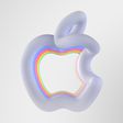
Apple today announced that WWDC 2025 starts June 9, and the logo for the conference hints at iOS 19's rumored new design.

Multiple sources have claimed that iOS 19 will feature a new design that is inspired by visionOS, the software platform for Apple's Vision Pro headset. The new design is expected to include more translucent buttons and menus, with a glass-like appearance. The "25" in this year's WWDC logo also has a subtle visionOS-like appearance.
iPadOS 19 and macOS 16 are also expected to have visionOS-like designs, which would make Apple's software platforms look more uniform.
In January, the YouTube channel Front Page Tech shared a render of a redesigned Camera app that is allegedly planned for iOS 19.
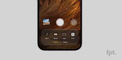
According to Front Page Tech host Jon Prosser, the Camera app will have more translucent buttons and menus, along with a larger viewfinder.
Earlier this month, Bloomberg's Mark Gurman said the visionOS-like design changes will extend to other interfaces on iOS 19, meaning that the new look with more transparency will likely extend to other Apple apps, notifications, and more.
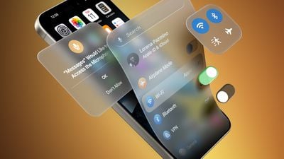
Gurman believes that iOS 19 will have the most significant design changes since iOS 7.
Apple is expected to unveil iOS 19 during the WWDC 2025 keynote on June 9, so we should get an official look at the new design in a few more months.