Apple has released newly updated versions of the iOS iBooks and iTunes U apps, bringing a clean look and feel to the app and getting rid of the wooden bookshelf look that has been a hallmark of the app since it was released.
Other than the new design, the apps do not appear to have gained any new features.
What's New in iBooks Version 3.2
iBooks has been updated with a beautiful new design for iOS 7.
What's New in iTunes U Version 1.4
This version of iTunes U has been updated for iOS 7 with an all-new look and feel.
Apple is expected to unveil iOS 27 during its WWDC 2026 keynote on June 8, and there are already many rumored features and changes for iPhones.
The first developer beta of iOS 27 will likely be available immediately following the keynote, and a public beta typically follows in July. Following beta testing, the software update should be released to all users with a compatible iPhone in...
Apple today released a new Pride Edition Sport Loop for the Apple Watch. The band features a rainbow design with 11 colors of woven nylon yarns.
The new Pride Edition Sport Loop is available to order now on Apple.com and in the Apple Store app in 40mm, 42mm, and 46mm sizes, and it will be available at Apple Store locations starting later this week. In the U.S., the band costs $49.
There...
iOS 26.5 is expected to be released next week, following more than a month of beta testing. The update is relatively minor, but there are a couple of new features and changes across the operating system that we have recapped below.
iOS 26.5 lays the groundwork for end-to-end encryption for RCS in the Messages app and ads in the Apple Maps app, and it will include a new Pride wallpaper and a...
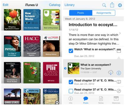
So, I've been pretty vocal in my career (I write iOS apps) as to how much I don't like the "deference" argument in iOS 7. I mean, look at how ugly that list view is? That list view in the right image (for the posts/assignments) is just awful. It doesn't look clean, or minimal. It seems cluttered and extremely noisy.
Am I the only one who thinks so? So many blue artifacts makes the use of the color pointless. You can select certain blue things. Certain blue things are just more blue indicating they are selected and some things have such a minimal use of blue that the only think you can do is just try tapping on everything with blue to see if anything happens. It's awful. Again, IMHO. :(
+1 for removing the goofy 2007-era wooden bookshelves
-1 for blinding white background
-1 for thin light blue text on white background
-1000 for replacing clean, instantly recognizable icons with disjointed text that must be read