Jony Ive Put Apple's Marketing Team in Charge of iOS 7 Icon Design
 The Next Web has given us a peek behind the scenes at the development of the new and controversial user interface in iOS 7.
One of the more revealing points in the piece is that Jony Ive, recently put in charge of software as well as hardware design, tapped Apple's marketing and communications team -- MarCom -- to design the look and feel of the icons. Then, with those as a guide, the iOS design teams went to work.
First of all, many of the new icons were primarily designed by members of Apple’s marketing and communications department, not the app design teams. From what we’ve heard, SVP of Design Jony Ive (also now Apple’s head of Human Interaction) brought the print and web marketing design team in to set the look and color palette of the stock app icons. They then handed those off to the app design teams who did their own work on the ‘interiors’, with those palettes as a guide.
The site
goes on to note that the design is "firmly a 'work in progress'", and that the look and feel of the icons and other new UI bits are likely to change significantly as the iOS 7 beta proceeds.
Popular Stories
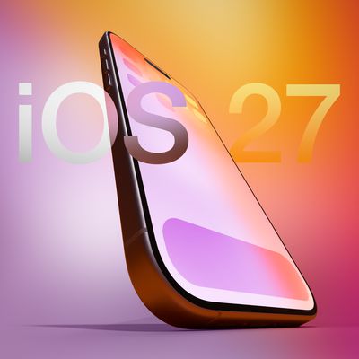
Apple is expected to unveil iOS 27 during its WWDC 2026 keynote on June 8, and there are already many rumored features and changes for iPhones.
The first developer beta of iOS 27 will likely be available immediately following the keynote, and a public beta typically follows in July. Following beta testing, the software update should be released to all users with a compatible iPhone in...
Apple today released a new Pride Edition Sport Loop for the Apple Watch. The band features a rainbow design with 11 colors of woven nylon yarns.
The new Pride Edition Sport Loop is available to order now on Apple.com and in the Apple Store app in 40mm, 42mm, and 46mm sizes, and it will be available at Apple Store locations starting later this week. In the U.S., the band costs $49.
There...
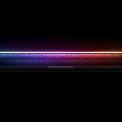
Apple refreshed the 14-inch and 16-inch MacBook Pro with M5 Pro and M5 Max models in March 2026, but depending on your needs and interests, you might want to skip this generation because there's something better in the works.
The M5 Pro and M5 Max MacBook Pro models have faster chips, but the same design that Apple has used since 2021. An updated design with new display technology and faster ...