The most notable change to iOS 26 is the Liquid Glass design overhaul, which is the first major iOS design update since Apple rolled out iOS 7 back in 2013. There are new features in iOS 26, of course, but added functionality has definitely been sidelined in favor of the design refresh.

We've compiled a walkthrough of Liquid Glass, so you know what to expect when you install iOS 26. A lot of what's here is also applicable to iPadOS 26 and macOS Tahoe too.
Keep in mind that Apple is still refining Liquid Glass and some of the design could see further changes, but we'll update this guide with each revision.
Overview
Liquid Glass is translucent, and it's meant to behave similarly to real glass. It allows light and color to filter through, so you'll see bits of the background behind buttons, menus, and other interface elements.

Light is subtly reflected off of Liquid Glass buttons, which is noticeable when you move your iPhone. Apple says that Liquid Glass is designed to use real-time rendering to dynamically react to movement with reflective highlights.
App Icons
App icons are meant to look like layered glass, giving them a subtle depth. Apps like Messages, Weather, Photos, and Maps have a top layer icon design over a bottom color, for example, so you can see a hint of a 3D look.

Apple designed icons to have the same general colors as iOS 18, but there is an option to turn on an all-glass icon look by choosing the "Clear" option in the Home Screen customization interface.
Lock Screen
Liquid Glass is unmistakable from the moment you pick up an iPhone running iOS 26. The Lock Screen features Liquid Glass Control buttons (which are customizable like before), an option for a Liquid Glass design for the clock, and translucent notifications that use a more frosted variant of Liquid Glass.

The Clock is particularly interesting, because Apple designed it to merge more seamlessly with your wallpaper. If you use a photo wallpaper, the time readout will change in size to fit inside the empty space on the display.

Widgets that are on the Lock Screen also have a Liquid Glass design, with widgets, the Control Center buttons and the time reflecting the light with the movement of your iPhone.
Home Screen
App icons have the aforementioned layered look with the option for entirely clear icons, and widgets have the same design. When you turn on the clear icon option, widgets also adopt a much more translucent Liquid Glass design.

The dock is transparent and blends into the background behind it, and the same is true of the search interface. App folders have a soft, frosted Liquid Glass design that changes tint based on your wallpaper. The App Library has a similar look.
![]()
As you tilt and move your iPhone, you can see subtle glints of light reflecting off of the app icons, dock, folders, and search bar.

Control Center
When Apple released the first beta of iOS 26, Control Center was so translucent it was almost unreadable. Apple made the Control Center buttons darker and more opaque, improving readability.

Control Center buttons now have a frosted glass look, but you can still see hints of what's in the background behind them.
Apps
In apps, Liquid Glass is noticeable in menu bars, navigation bars, and buttons. Most of Apple's apps have received a Liquid Glass update, and you'll see Liquid Glass almost anywhere there's a button, bar, or menu. Apple wanted navigation bars and menus to appear to be floating over the content in the app, and there is a distinctive layered look to navigation elements.

Navigation bars in apps are translucent and you can see some of the app's background behind them, especially when scrolling. Interface elements tend to fade more into the background to put the focus on content. Liquid Glass is accompanied by design changes in the form of pop out menus, rounded button designs, and disappearing navigation bars in select apps, with some of the more notable changes listed below.
- Safari - Safari's Tab Bar uses Liquid Glass, and there's also a new Compact option. When you scroll, the Tab Bar collapses down, and you'll only see the website address. Scrolling back up brings it back. The interface for swapping between tab groups has changed, and all buttons also use Liquid Glass.
- Photos - Photos no longer has a unified design, and there are separate Library and Collection tabs, along with a dedicated search button. Navigation bars disappear as you browse through your images, and all buttons have a rounded look.
- Camera - The Camera app features one of the most notable design updates. Navigation has been distilled down into just a Video and a Photo button, though you can swipe to get to other modes. Tapping on a button displays pop out menu with a Liquid Glass design.
- Messages - Messages looks largely the same, but buttons have a frosted glass look and the keyboard's edges are rounded. Buttons and bars have the same rounded look as the rest of iOS 26.
- Maps - Maps also looks similar to the iOS 18 version of the app, but with more rounded interface elements and slightly more translucency.
- App Store - The App Store app has a slimmed down navigation bar at the bottom with a frosted glass look. It can be almost translucent on some darker backgrounds.
- Apple Music - Apple Music has the same translucent navigation bar as the App Store, with a design that shows the background through the bar.
- Phone - The Phone app has an opt-in unified view with Liquid Glass-style buttons.
- Weather - There's no more bottom bar in the Weather app, and instead, there are Liquid Glass buttons for changing locations and accessing settings.
Mail, Notes, Reminders, Health, News, and other Apple apps all have similar changes, primarily in the form of buttons that are slimmed down, rounder, and slightly more translucent.

Functionally, it's only the Camera app, the Photos app, and the Phone app (if using the unified view) that have significant navigation changes. For the most part, app buttons are in the same place and work in the same way, even though they have a different look.
How Liquid Glass Has Evolved
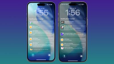
In the first developer beta, Liquid Glass had a heavy emphasis on translucency. So much so that text in areas like the Notification Center and the Control Center could be difficult to read.
 iOS 26 beta 1 on left, iOS 26 beta 2 on right
Almost all of the interface was transparent, with color showing through behind everything. With white text and Apple having little to no control over the background colors of wallpapers and content, usability was a problem.
In the second developer beta that came out on June 23, Apple addressed the translucency of the Control Center, which was one of the areas that received heavy initial criticism. Apple increased the opacity of the buttons in the Control Center, and further blurred the background. Translucency for interface elements on the Lock Screen and the Home Screen also saw minor tweaks.
Apple made further changes in the third developer beta, rolling back some of the Liquid Glass translucency in app menu bars and buttons.
 iOS 26 beta 2 on left, iOS 26 beta 3 on right
 iOS 26 beta 2 on left, iOS 26 beta 3 on right
In the fourth beta, some of the translucency was reintroduced, and now we have a design that's not quite as transparent as the Liquid Glass that was demonstrated at WWDC, but that isn't as opaque as what we had in the third beta.
 Beta 4 on right, beta 3 on left
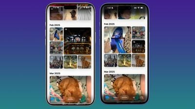 Beta 4 on left, beta 3 on right
With every beta update, there have been complaints from people who think there's too much transparency, and those who want more transparency. Apple is still working to find a balance, and we could see further changes in the future.
Criticism
People have strong opinions about Liquid Glass. Some love the novelty of a fresh look, and others think that it's a usability nightmare that's almost unreadable in some situations.
Apple so far hasn't managed to strike enough of a balance to satisfy everyone, and so far, it doesn't look like the company plans to compromise with a slider for customizability.
Do you like the Liquid Glass design, or do you want to see Apple scrap it? Let us know in the comments.
iPadOS 26 and macOS Tahoe
The Liquid Glass design extends to iPadOS 26, macOS Tahoe, watchOS 26, and tvOS 26, with all of the updates adopting similar translucency for various interface elements. iPadOS 26 is the closest to iOS 26, featuring the same general design across the operating system and in Apple apps.

Apple wanted to improve design cohesiveness for its software across different devices, so you'll see Liquid Glass on all of your Apple products when you update to the latest operating systems in the fall.
Read More
For more on the features that are included in iOS 26, check out our iOS 26 roundup.