Apple Seeds First macOS Tahoe Public Beta - MacRumorsOpen MenuShow RoundupsShow Forums menuVisit ForumsOpen Sidebar
Skip to Content

Apple Seeds First macOS Tahoe Public Beta

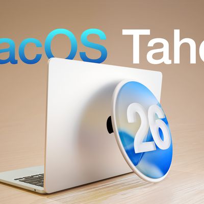
Apple today provided public beta testers with the opportunity to test the newest version of macOS, macOS Tahoe, ahead of its launch this fall. If you want to sign up for the ‌macOS Tahoe‌ public beta, you can do so on Apple's beta website. The first Tahoe public beta is identical to the fourth developer beta that was released on Tuesday.

macOS Tahoe 26 Thumb 2
Public beta testers can download ‌macOS Tahoe‌ from the Software Update section of the Settings app after signing up for the betas.

‌macOS Tahoe‌ has the same Liquid Glass design as iOS 26, and it extends to app icons, folders, the Dock, in-app navigation, menus, the Control Center, and the Menu Bar. The Control Center and the Menu Bar are both customizable, and you're also able to customize folders, app icons, and widgets.

macos tahoe design
Safari has an updated tab design and a redesigned sidebar, and Apple has brought the Phone app to the Mac for making phone calls through Wi-Fi Calling. The Phone app supports the new Call Screening and Hold Assist features.

Spotlight has been overhauled with improved search and the ability to execute hundreds of actions without opening up an app. There's a new Games app with a Game Overlay feature, and developers have access to Metal 4.

More on what's new can be found in our macOS Tahoe roundup.

Related Roundup: macOS Tahoe
Related Forum: macOS Tahoe

Popular Stories

imac video apple feature

Apple Released Yet Another New Product Today

Friday March 20, 2026 2:39 pm PDT by
Apple has unveiled a whopping nine new products so far this March, including an iPhone 17e, iPad Air models with the M4 chip, MacBook Air models with the M5 chip, MacBook Pro models with M5 Pro and M5 Max chips, the all-new MacBook Neo, an updated Studio Display, a higher-end Studio Display XDR, AirPods Max 2, and now the Nike Powerbeats Pro 2. iPhone 17e features the same overall design as...
iPhone 18 Pro Deep Red Feature

iPhone 18 Pro Launching Later This Year With These 12 New Features

Wednesday March 18, 2026 7:39 am PDT by
While the iPhone 18 Pro and iPhone 18 Pro Max are not expected to launch for another six months or so, there are already plenty of rumors about the devices. It was initially reported that the iPhone 18 Pro models would have fully under-screen Face ID, with only a front camera visible in the top-left corner of the screen. However, the latest rumors indicate that only one Face ID component...
ios 26 4 pastel

iOS 26.4: Top 10 New Features Coming to Your iPhone

Friday March 20, 2026 2:44 pm PDT by
iOS 26.4 isn't the major update with new Siri features that we hoped for, but there are some useful quality of life improvements, and a little bit of fun with an AI playlist generator and new emoji characters. Playlist Playground - Apple Music has a Playlist Playground option that lets you generate playlists from text-based descriptions. You can include moods, feelings, activities, or...

Top Rated Comments

9 months ago

It's quite bad, not gonna lie. Tabs are readable, but the design there is far from ideal.
I wish it was readable at least.


Unbelievable they won't bring back compact tabs too.
The level of design they are putting out these days is absolutely soulless & decadent.

Attachment Image
Score: 15 Votes (Like | Disagree)
bradman83 Avatar
9 months ago
Liquid Glass is fine, it's used so sparingly across the OS that it's not that intrusive. But the whole OS just feels... ugly. When I heard Apple was adopting the glassy look from visionOS I was excited because I was hoping they'd be taking the gray, smoked glass look. I think the fundamental problem with this redesign is that they're trying to do everything white on white using only faint shadows and gradients to provide depth and differentiation.

My biggest issue is the sidebars. Since Yosemite sidebars have had a visual differentiation from the main window by using a soft, blurred translucency. Now they're a slab of Liquid Glass that floats above the window contents. For apps like Maps or Home it provides a neat effect because the contents slide under the sidebar, but for the majority of windows there's nothing underneath, it's just plain white with a tiny hint of color refraction from the desktop or window contents.
Score: 7 Votes (Like | Disagree)
9 months ago
It is ugly. Reducing transparency helps, but it's still unnecessarily ugly.
Score: 7 Votes (Like | Disagree)
9 months ago
"MacOS Tahoe is out, it has liquid glass design, updated safari tabs and the phone app. Also spotlight."

Guys, the revolution is underway.
Score: 5 Votes (Like | Disagree)
9 months ago

Has anyone tried Safari on MacOS yet? Are tabs readable now?
If it’s the same build as yesterday’s Beta 4, then the answer is Nope. Safari is hot garbage in macOS26. They will need so much time to fix that / rollback some of those changes to make it atleast “usable”…
Score: 5 Votes (Like | Disagree)
9 months ago
Played around with the beta a bit more. Dark mode is even more atrocious. Totally deactivated it. My thoughts:
Trillion dollar company developed a skin that looks like a 10 year old 3rd party theme for Android phones. Whoever designed this should be fired.
Score: 4 Votes (Like | Disagree)
Related Apple News: Sport | Travel | Technology | Ipad | World News