Third-Party Mac Icons Reimagined in OS X Yosemite Style

With the introduction of OS X Yosemite, Apple introduced a significant visual change with an iOS 7-like "flat" look and completely redesigned icons. While Apple's icons will see a refresh once Yosemite is released, users will have to wait until third-party companies have updated their icons to match Apple's new design language for OS X icons.

In the meantime, users in this long running MacRumors' forums thread have been designing their own "flat" versions of both Apple and third-party applications, allowing some users to switch out their icons until the real thing is available. Additionally, some users are redesigning Apple's own icons for users who are using Mavericks rather than the Yosemite beta.

icons
iWork, Twitter, Skype and 1Password icons by Arn0

While the icons may not be fully representative of the official icons, they do provide a look into Apple's new icon philosophy enacted upon an icon not designed for it, allowing for a glimpse into various companies' processes.

Forum member Arn0 had been taking requests from other forum members, recreating various icons to fit more along more nicely with Yosemite's design aesthetics.

Alongside stand-alone apps like 1Password, Twitter and Skype, Arn0 also redesigned icons for entire suites of software, like Adobe's Creative Suite. Thread starter Humex has been sharing a number of different examples of flat OS X icons from around the web, including concepts that hew closer to Apple's style than Arn0.

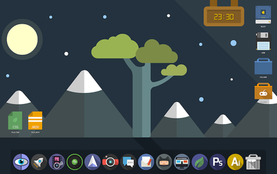
Alternatively, designers like drflash have taken a different approach to flat design. Rather than mimic Apple's philosophy and match OS X Yosemite, they created their own design language with Flat OS, which provides a completely different experience for OS X users. The design seems to marry "flat" design alongside some skeumorphic principles, giving icons a more tangible feel.

flatos
Flat OS X by drflash

In a blog post on Gizmodo, MartianCraft's Nick Keppol explains that Yosemite's new look centers around four basic ideas: visual rhythm in the dock, three basic icon shapes and their design grid, shape hierarchy and lighting effects and materials.

Visual rhythm allows the new dock to look more consistent, although that is helped by the fact that OS X icons are now broken up into three types: circles, squares and titled rectangles. While Apple itself isn't totally consistent with these three types, Keppol found that - for the most part - circles are used for more consumer-oriented apps, squares are used for System-related utilizes and titled rectangles are used for applications that are most often used for work.

Finally, Apple uses Hollywood-style yellow and orange highlights and blue and teal shadows to give the metal-like materials that the icons are made out of feel warm and tangible. This helps create the illusion that the icons are more physical than previous icons while also looking flatter than before.

If you'd like to switch out your icons until they're fully upgraded with OS X Yosemite, the icon sets shown are linked above, while all of Arn0's redesigned icons are available to download via Dropbox. Icon sets from arn0 and other designers are also available to download via the forum thread. Here are easy instructions on how to change app icons on OS X.

Popular Stories

Aston Martin CarPlay Ultra Screen

Apple's CarPlay Ultra to Expand to These Vehicle Brands Later This Year

Sunday February 1, 2026 10:08 am PST by
Last year, Apple launched CarPlay Ultra, the long-awaited next-generation version of its CarPlay software system for vehicles. Nearly nine months later, CarPlay Ultra is still limited to Aston Martin's latest luxury vehicles, but that should change fairly soon. In May 2025, Apple said many other vehicle brands planned to offer CarPlay Ultra, including Hyundai, Kia, and Genesis. In his Powe...
Apple Logo Black

Apple's Next Launch is 'Imminent'

Sunday February 1, 2026 12:31 pm PST by
The calendar has turned to February, and a new report indicates that Apple's next product launch is "imminent," in the form of new MacBook Pro models. "All signs point to an imminent launch of next-generation MacBook Pros that retain the current form factor but deliver faster chips," Bloomberg's Mark Gurman said on Sunday. "I'm told the new models — code-named J714 and J716 — are slated...
iOS 26

iOS 26.3 and iOS 26.4 Will Add These New Features to Your iPhone

Tuesday February 3, 2026 7:47 am PST by
We are still waiting for the iOS 26.3 Release Candidate to come out, so the first iOS 26.4 beta is likely still at least a week or two away. Following beta testing, iOS 26.4 will likely be released to the general public in March or April. Below, we have recapped known or rumored iOS 26.3 and iOS 26.4 features so far. iOS 26.3 iPhone to Android Transfer Tool iOS 26.3 makes it easier...
Apple MacBook Pro M4 hero

New MacBook Pros Reportedly Launching Alongside macOS 26.3

Sunday February 1, 2026 5:42 am PST by
Apple is planning to launch new MacBook Pro models with M5 Pro and M5 Max chips alongside macOS 26.3, according to Bloomberg's Mark Gurman. "Apple's faster MacBook Pros are planned for the macOS 26.3 release cycle," wrote Gurman, in his Power On newsletter today. "I'm told the new models — code-named J714 and J716 — are slated for the macOS 26.3 software cycle, which runs from...
iOS 26 Home Feature

Apple Gives Final Warning to Home App Users

Tuesday February 3, 2026 8:55 am PST by
In 2022, Apple introduced a new Apple Home architecture that is "more reliable and efficient," and the deadline to upgrade and avoid issues is fast approaching. In an email this week, Apple gave customers a final reminder to upgrade their Home app by February 10, 2026. Apple says users who do not upgrade may experience issues with accessories and automations, or lose access to their smart...

Top Rated Comments

iRock1 Avatar
151 months ago
Oh please, don't start giving ideas to Apple. Following this frigging absurd path, it wouldn't surprise me at all if they come out with something like this in a few years:

Score: 21 Votes (Like | Disagree)
Lapidus Avatar
151 months ago
I don't think they ALL should be round..
Score: 21 Votes (Like | Disagree)
MacFather Avatar
151 months ago
Deleted.
Score: 20 Votes (Like | Disagree)
designaholic Avatar
151 months ago
No.
Score: 17 Votes (Like | Disagree)
RightMACatU Avatar
151 months ago
I hate 'em, I hate 'em, I hate 'em!
Took 20+ years to get some nice 3D effects in OSs and Apps; Took only one year to take it all out. I guess that they simply ran out of ideas esthetically-wise ;)
Score: 13 Votes (Like | Disagree)
QCassidy352 Avatar
151 months ago
I don't like them at all. I hope people realize that "flat" is not inherently better or a logical step forward, regardless of what Apple says in its keynotes. Its a design choice, just like skeuomorphism, which some people will like and others will not, and which can be taken to an extreme (or not).

IMO, there's a happy medium to be struck between "felt" in Game Center or "ripped edges" in Calendar and this cartoony mess.
Score: 13 Votes (Like | Disagree)